How do I Use Trading Charts?
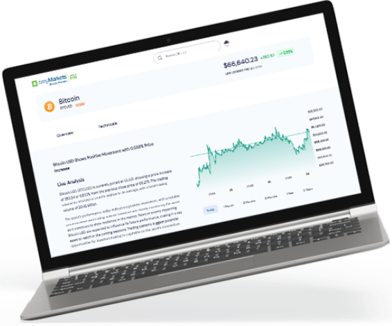
The charts featured on the easyMarkets platform are highly flexible and easy to use. They help you understand how a market or instrument has performed over a set time period. Charts can also help you discern emerging or diminishing trends, volatility and price action surrounding events.
Different chart types
Log into the easyMarkets platform and click on the ‘candlestick’ symbol to choose the chart type you prefer – bars (A.K.A. OHLC), candlesticks, hollow candlesticks, Heikin Ashi, Line, Area and Baseline. On the right-hand axis of the chart (the Y axis) you see prices and on the bottom (or X) axis you have time frames.

Bar Charts
Bar charts (also known open-high-low-close or OHLC charts) give volatility information that you won’t get with line charts. You can determine volatility through the height of the bars and the market sentiment through the price range from open to close.

In the image on the left-hand side we see the closing price is higher than the opening price meaning that the overall price direction was positive and therefore bullish. The image on the right shows a bearish price sentiment where the close price is lower than the open. The colors of the bars depend on the closing price versus the previous days close. A green bar shows that the close price is higher than the previous day’s close. If the close price is lower than the previous day’s, then the bar is red.

Candlestick Charts
Candlestick charts are one of the most popular ways to view prices as they provide quite a lot of information in a quick and easy manner. The ‘candles’ have a rectangular solid body, showing the range between opening price and closing price. The candles also have vertical lines (or wicks) at the top and bottom that show high to low range. A green candle shows that the close was higher than the previous close while a red candle shows the opposite – that the close was lower than the previous close.


Hollow Candlesticks
The Hollow Candlestick chart is a variation on one of the more popular types of charts – candlesticks. Instead of all candlesticks being the same albeit being red or green that shows whether the opening price is higher or lower than the closing price – some of these are hollow. In the case where the closing price is higher than the opening price it is green and known as a bullish candle, inversely if the opening price is lower than the closing price the candlestick is red and known as a bearish candle. The hollow candlestick chart gives another layer of information comparing the previous trading day with the current day’s prices.
Solid Green Candle:
Indicates a close price higher than the previous close price but both lower than the current day’s opening price.
Hollow Red Candle:
The closing price is lower than the previous sessions, but both are higher than the current day’s open price.
Solid Red Candle:
The close price is both lower than the previous and the current day’s open price.

Heikin Ashi
Similar visually to candlestick charts, the Heikin Ashi instead chart average price movements –resulting in a smoother chart – that is purported to better delineating trends. This in turn also means that Heikin Ashi does not display the opening and closing prices exactly.

Line Charts
Line charts are perhaps the simplest way to view the data. A line is drawn across all closing prices to enable a reading of price action over a set period of time. They offer a quick and clear view of price direction.

Time Scales
At the top of the chart you can select which time scale (or period) you wish to view the chart in – from 1 minute to hourly and daily.

Indicators
Across the top of the chart you can select and overlay indicators on your chart for technical analysis. If you select the ‘Indicators’ you will get a large range of trend indicators to choose from that will displayed in a separate dialogue box. These include Moving Average and Bollinger Bands® to name two and oscillators like RSI and MACD.

Symbols Comparison
This allows you to add the charts of two markets onto the one chart so you can see how they compare and even analyze any correlations or divergences. In the image you can see the EUR/USD candlestick chart and below the XAU/USD (gold) line chart.

Customization Tools
On the left-hand side of the chart you have a range of tools to customize your view. Tools may help traders to recognize trends as they draw and mark up the charts.
The Pointer Tool
This lets you zoom into details on the charts with cross hairs, a point or an arrow so you can get a more precise reading.

Trendlines
Trendlines help identify up, down or sideways trends by drawing a line between two highs or two lows. This makes it one of the most popular tools used on charts.
The basic trendline shows you a line segment; a ray shows an extended trendline to the right. The extended trendline extends in both directions. Parallel channels allow for quick drawing of parallel trendlines – you only need to draw the one line while the other is automatically generated.
Within the broader category of trendline are different tools that offer different versions of the basic trendline. While a simple trendline gives a line segment, an arrow shows a trendline with an arrow, and a ray draws a right-extended trendline. ‘Extended’ gives a trendline that is extended automatically from both the sides.

Drawing Tools
Freehand and predefined shapes can help you further lay out and mark your analysis.

Text Tool
Annotate your chart with text and anchor it to specific area. Use various text shapes when analyzing price movement to help you better distinguish or label potential trends.

Chart Patterns
These overlays can be used when trading to discern patterns and trends emerging. This includes Elliot Waves, Cyclic Lines, XABCD patterns and much more. Up to 14 different patterns to choose from.

Measure Tool
This allows you to measure the change in price, the timeframe and the bars that is enclosed in the area you drew.

Magnet Mode
This is a standout chart feature, instead of fumbling around while drawing lines on an exact wick – magnet mode will snap the beginning of it to the closest OHLC value.

Other Features
Beyond the features mentioned in the article for analysis our latest chart update also allows the trader to:
Stay in drawing mode
Lock all drawing tools
Hide all drawing tools
Show object trees – which shows all the graphical actions made on the chart in the form of a drawing or an overlay.
A delete/clear function – this tool allows you to remove drawings (or drawing tools) remove indicators or remove both drawing tools and indicators.
These tools allow for a much more user-friendly experience, quick analysis when on the market, but extensive enough when used in an education/demonstrational way.


